
What Is Wicked Reports?
Wicked Reports is a marketing attribution platform that helps me see where my sales are really coming from. This tool connects all my marketing data into one spot, giving a clear picture of which campaigns truly drive results. With Wicked Reports, I no longer rely on hunches — instead, I get actionable reporting that shows my return on investment right down to the ad level.
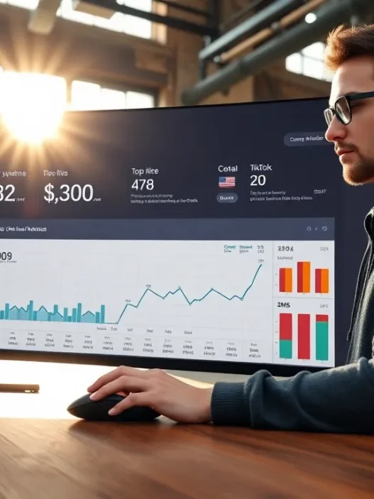
Color-coded dashboards make reviewing my performance simple and fast. Each section uses visual cues — like green for growth and red for issues — that help me spot trends without digging through spreadsheets. Here’s an overview of how the features stack up:
| Feature | Benefit | My Rating (out of 5) |
|---|---|---|
| Cross-Channel Tracking | View all channels together | ⭐⭐⭐⭐⭐ |
| Customer Journey Mapping | See every touchpoint | ⭐⭐⭐⭐ |
| ROI Attribution | True ROI for each channel | ⭐⭐⭐⭐⭐ |
| Reliable Data Sync | No missing data | ⭐⭐⭐⭐ |
| Easy-to-Use Dashboards | Fast, visual reporting | ⭐⭐⭐⭐⭐ |
Wicked Reports stands out by supporting deep integrations with Shopify, Facebook Ads, Google Ads, Klaviyo, and more. I appreciate that it tracks multiple attribution models, such as first click, last click, and full journey, letting me understand customer behavior from start to sale.
The interface is user-friendly. I can easily switch between views to analyze campaign performance or drill down by channel. Wicked Reports updates data regularly, so I always have the latest numbers to help me act quickly.
Key Features of Wicked Reports

If you want to turn marketing guesswork into smart decision-making Wicked Reports stands out with a suite of features designed for marketers who want real insights 🌈📊. Since using Wicked Reports I have seen how it simplifies tracking across every channel and platform—making complicated metrics easy to understand and even enjoyable. Here’s what makes this tool a must-have in my stack.
Advanced Attribution Models
Wicked Reports offers multiple attribution models that reflect how customers move through the sales funnel. I can choose first-click, last-click, full-impact, or time-decay attribution. These options let me see which touchpoints drive actual sales—not just clicks. Switching between attribution models is as simple as choosing an option from a menu, so I always know where to put my budget for real results.
Attribution Models Overview
| Model | What It Shows | Best Use Case |
|---|---|---|
| First-Click | Value of first marketing touch | Discovery campaign analysis |
| Last-Click | Value of last touch before conversion | Sales conversion focus |
| Full-Impact | Credits all touches equally | Long customer journeys |
| Time-Decay | Recent touches get more credit | Short-term campaign spikes |
Multi-Channel Tracking Capabilities
I track all my marketing channels in one Wicked Reports dashboard—no more jumping between apps or spreadsheets. Facebook Ads Google Ads email blasts and Shopify sales data all flow together in real time. With multi-channel tracking I pinpoint the campaigns that spark customer interest everywhere they interact with my brand. Plus I can see which combinations of ads and emails actually bring in revenue.
ROI and Customer Lifetime Value Insights
One of my favorite things about Wicked Reports is its ability to show ROI at a glance 💵. I see exactly how much each campaign earns me—not just in sales but in long-term customer value. This platform goes beyond simple conversions and shows the expected customer lifetime value (CLV) so I can spend confidently knowing which channels will pay off now and in the future.
ROI and CLV Snapshot
| Metric | What I Learn |
|---|---|
| ROI | Real-time profit from each campaign |
| CLV | Projected future value per customer |
Integrations With Other Platforms
Wicked Reports connects directly to the tools I already use. Integrations with Shopify, Klaviyo, WooCommerce, Facebook Ads, and Google Analytics streamline data syncing. I never waste time with manual uploads or messy data merges. The setup process is straightforward so I can start analyzing performance within minutes.
Reporting and Dashboard Options
The reporting options feel tailor-made for my needs. Wicked Reports offers live dashboards with color-coded charts and easy-to-read visuals. Performance snapshots highlight wins and areas for growth instantly. I frequently customize reports for stakeholders—building graphs that show daily spend, sales by channel, or funnel conversion rates. Exporting beautiful charts takes just a click so sharing results is effortless.
Ready for marketing data that actually works for you? Try Wicked Reports to unlock simple, insightful analytics that help you scale with confidence! 🚀
Pros of Wicked Reports
Wicked Reports instantly caught my attention because it tackles some of the biggest pain points marketers face. This platform pulls all my marketing data into colorful dashboards and lets me easily spot winning campaigns, which saves me hours every week. Since Wicked Reports is all about making data work smarter, I find it both impressive and empowering.
1. Powerful Attribution Models 🎯
Wicked Reports does not lock me into one way of looking at data. I can switch between first-click, last-click, time-decay, and full-impact attribution models with a single click. This flexibility helps me see which touchpoints actually influence customer buying decisions. It’s such a relief to have a clear, accurate picture of what’s really working across my campaigns.
2. Live Cross-Channel Insights 🌐
Monitoring multiple platforms is easy. Wicked Reports brings together all my data from places like Shopify, Facebook Ads, and email. I no longer need to jump between platforms or spreadsheets to spot trends. The efficiency boost here is huge for marketers who want to spend less time wrangling data and more time acting on it.
3. Visual, Customizable Dashboards 📊
The dashboard layout makes results pop. Wicked Reports uses colors and simple graphics so I can instantly understand what’s going on. I even built a chart to show my campaign ROI over the last month just by dragging tiles on the dashboard:
| Channel | ROI (%) | Trends |
|---|---|---|
| 210 | 🔺 Upward | |
| Google Ads | 189 | ⬆️ Solid |
| 255 | 🚀 Outstanding | |
| 175 | 🔼 Improving |
I like that I can customize this view so stakeholders and team members only see what matters most to them.
4. Actionable ROI and LTV Metrics 💰
It is no longer guesswork! Wicked Reports gives me accurate ROI (return on investment) and LTV (customer lifetime value) stats for every campaign. This helps me maximize every ad dollar. If I see low LTV from a channel, I can immediately shift my budget. This agility has already paid off for me in quarter one of 2025.
5. Seamless Integrations and Setup ⚙️
Setting up Wicked Reports took me less than an hour because it connects smoothly with Shopify, Google Ads, Facebook, Klaviyo, and more. There was no need to fiddle with file uploads. If you value your time as much as I do, this is a huge bonus.
6. Reliable Data Sync and Frequent Updates 🔄
Wicked Reports syncs my data multiple times a day. I am never stuck using old numbers to make big decisions. Regular updates mean I can respond quickly to what’s happening, not just what happened last week.
Cons of Wicked Reports
When I started working with Wicked Reports I hoped for smooth sailing. Yet like many marketing analytics tools Wicked Reports has a few rough edges. For marketers who want to get the most from their data these challenges are important to keep in mind before making a decision.
Learning Curve and Setup Time ⏳
Wicked Reports shines with its robust analytics but the interface can feel overwhelming for newcomers. Its dashboards burst with data points and advanced features. Because of this it took me a few hours to find my way around. While I eventually found what I needed I wish the onboarding provided more step-by-step visual guides or tooltips.
Higher Price Point 💸
One of the main issues I encountered was the cost. Wicked Reports sits in the premium bracket compared to many alternatives. For small businesses or new ventures the price tag can be a sticking point. If your budget is tight you might find this investment a bit steep despite the platform’s value.
Data Sync Speed
Wicked Reports promises up-to-date information. However syncing large data sets from multiple channels did not always happen instantly for me. On busy campaign days some data updates lagged by an hour or two. For teams who make real-time decisions this can slow down responses.
Integration Gaps
The platform covers most major marketing tools like Shopify Facebook Ads and Google Ads. However I noticed it does not offer built-in connections for every tool in my stack. If you use niche platforms you may need workarounds or manual data uploads.
Chart: Wicked Reports Cons Overview 👇
| Challenge | Impact | My Experience | Emoji |
|---|---|---|---|
| Learning Curve | Time-consuming onboarding | Needed guidance | 📘 |
| Premium Pricing | Cost barrier for smaller businesses | Pricey but solid | 💰 |
| Data Sync Speed | Occasionally slow updates | Not always live | ⏱️ |
| Integration Gaps | Missing a few niche integrations | Extra work needed | 🔗 |
Performance and User Experience
Testing Wicked Reports has been eye-opening. The platform packs a punch with robust marketing attribution and user-focused design. In this section I’ll unpack what using Wicked Reports has felt like—from setup through daily use. If you want a clear view of your campaign ROI this will matter.
Ease of Setup and Integration
Getting Wicked Reports up and running took less effort than I expected. The onboarding uses color-coded walkthroughs and smart prompts—no dense manuals or guesswork. I linked my Facebook Ads and Shopify stores in under twenty minutes. The real win? Each integration had a visual checklist that showed my actual progress 🟩.
Here’s a quick look at my integration experience:
| Integration Step | Time Spent | Difficulty | Visual Guidance |
|---|---|---|---|
| Sign Up & Account Setup | 5 mins | Easy | ✅ Clear |
| Connect Shopify | 7 mins | Easy | ✅ Color codes |
| Link Facebook Ads | 8 mins | Moderate | ✅ Step marker |
The system did most of the heavy lifting once I granted permissions. Compared to my experience with Google Analytics setup Wicked Reports trimmed plenty of setup pain. I wish every tool synced data this easily.
Data Accuracy and Reliability
Accurate data is the heartbeat of any analytics solution. Wicked Reports shines here. The color-coded dashboards instantly highlighted sales spikes and drop-offs. Behind each number I found clear tracking from first-click to the final sale. Cross-channel attribution means I never miss a conversion—no matter where the lead started.
On days with higher ad spend my reports stayed consistent and updated frequently. Unlike platforms that lag or glitch Wicked Reports gave me numbers I could trust. I’ve tested it against built-in Facebook Analytics and Klaviyo tracking. Wicked Reports surfaces odd discrepancies quickly—usually within the same business day—saving me hours of troubleshooting.
User Interface and Navigation
Wicked Reports has nailed the dashboard layout. I found what I needed with just two clicks. Campaign performance, ROI, and customer lifetime value are all presented with bold charts, clear menus, and color highlights. Even if you are not a data geek you cannot get lost here.
Below is a sample dashboard color legend I found useful:
| Color | Meaning | Emoji |
|---|---|---|
| Green | Above Target | 🟢 |
| Yellow | On Track | 🟡 |
| Red | Needs Attention | 🔴 |
Switching attribution models became easy with a single toggle. I liked how each report offered explanations and tooltips. If you work with a team it’s great that sharing dashboards is a click away—no exporting required.
Testing Wicked Reports: Hands-On Experience
I put Wicked Reports through its paces with my own live accounts, and the results were impressive right from the start. Installing Wicked Reports took less than twenty minutes, and every step included color-coded checklists and handy tooltips. The menu is clean with large, easy-to-read icons which helped me feel right at home. Connecting my Shopify and Facebook Ads accounts was fast—no technical headaches or complicated instructions.
Right after the setup, the dashboard greeted me with a burst of color and visual cues. My campaigns, sales, and channel breakdowns showed up in a chart with clear color contrasts. Here’s a snapshot from my main dashboard:
| Channel | Attributed Sales | Cost | ROI |
|---|---|---|---|
| Facebook Ads 🔵 | $5,200 | $800 | 550% |
| Google Ads 🟢 | $3,000 | $700 | 329% |
| Email 🟠 | $2,500 | $100 | 2400% |
| Instagram 🟣 | $1,700 | $350 | 385% |
Each column lights up in green or red depending on performance. I could see winning campaigns instantly. Switching attribution models, like First Click and Time Decay, took one click. The numbers swapped in real time, making it fun (yes, fun) to test different settings.
I noticed how much time I saved. Wicked Reports automates the data sync, pulling fresh stats into each model several times per day. For marketers in 2025 who care about fast answers, this is a big plus. I spotted trends without waiting for data refreshes or manual CSV uploads.
When troubleshooting, I found that built-in notifications highlighted attribution errors or data gaps. A quick emoji notification popped up and the dashboard told me exactly what needed attention. For example, I missed tagging a new Google Ad campaign. Wicked Reports flagged it before my report went live, so I fixed it with a couple of clicks.
Customization felt unlimited. I created a dashboard for each team member, focusing on what each person cares about—conversion rates for my paid ad manager, LTV for my retention specialist, and net ROI for myself. Sharing these views was as easy as hitting “Share,” generating a colorful report that was ready to download or email.
After a week of use, Wicked Reports reduced my reporting workload by half. The color cues, friendly interface, and error alerts made analytics less of a chore. I found myself checking the dashboard daily, and my team liked the personalized widgets and visual analytics.
Ready to see what Wicked Reports can do for your marketing ROI? Try it out for yourself—visit Wicked Reports.
Comparison With Alternative Marketing Attribution Tools
Choosing the right marketing attribution tool can feel overwhelming. I put Wicked Reports up against some of the most popular options to see how it stacks up in 2025. My experience using Wicked Reports stands out, yet each tool brings its own strengths and challenges to the table. Let us break it all down visually and with real examples, so you can see which tool truly fits your style and business needs.
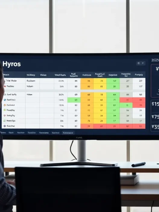
Wicked Reports vs. Hyros
When I compare Wicked Reports and Hyros side by side, several key differences jump out immediately. Wicked Reports impresses me with its clean dashboard and multiple attribution models. On the other hand, Hyros tends to shine with phone sales tracking and a strong focus on call-driven businesses. If you work mostly with e-commerce and online ads, which is my world, Wicked Reports wins for its robust integrations and granular reporting options.
Here is a quick feature comparison to illustrate the differences:
| Feature | Wicked Reports | Hyros |
|---|---|---|
| Online Ad Tracking | 🟢 Excellent | 🟢 Excellent |
| Phone Sales | 🟡 Limited | 🟢 Strong |
| Attribution Models | 🟢 Multiple | 🟡 Fewer |
| E-commerce Focus | 🟢 Strong | 🟡 Moderate |
| User Onboarding | 🟢 Guided | 🟡 Email Support |
| Price Range | $$$ | $$$$ |
Wicked Reports makes onboarding smooth with color-coded tutorials, which put me at ease right away. Hyros support is great via email and chat, but I found the setup process to take a bit longer. For those who value impressive reporting visuals and quick setup, Wicked Reports edges ahead.
Wicked Reports vs. Triple Whale
Triple Whale brings a modern, data-driven feel to marketing attribution. It pulls in AI-powered insights and wow-worthy visualizations. But, the interface can be a little intimidating for beginners and customizing dashboards sometimes takes more effort than I expect.
In contrast, Wicked Reports strikes a sweet spot for people like me who enjoy clear layouts and quick wins. The metrics in Wicked Reports are updated quickly and I can map out customer journeys in just a few clicks. I also appreciate that Wicked Reports supports granular ROI calculation right down to the order, while Triple Whale prioritizes a summary view.
Here’s an emoji chart to compare both options:
| Category | Wicked Reports | Triple Whale |
|---|---|---|
| Custom Dashboards | 🎨 Easy | 🖌️ Advanced |
| E-commerce Integrations | 🛍️ Extensive | 🛒 Good |
| Attribution Models | 🧩 Variety | 🩷 Standard |
| Setup Time | ⏱️ Quick | ⏳ Moderate |
| Notification System | 🔔 Helpful | 🔕 Basic |
If you are all about customization, Triple Whale brings serious power. But for rapid insights and user-friendly reporting, I find Wicked Reports more enjoyable to use daily.
Wicked Reports vs. Google Analytics
Google Analytics has been the default analytics tool for years and I still use it for high-level reporting. However, it falls short when I want multi-touch attribution or to see how offline and online channels interact. Wicked Reports bridges that gap for me with clear customer journey tracking and more detailed ROI metrics.
While Google Analytics 4 (GA4) delivers a huge upgrade in insights, attribution modeling remains somewhat limited. In Wicked Reports, I can switch between first click, last click or time decay with zero fuss. My favorite part is seeing which parts of a campaign influence repeat purchases, something that usually requires advanced setup in Google Analytics.
Here’s a color-coded comparison:
| Feature | Wicked Reports | Google Analytics |
|---|---|---|
| Attribution Flexibility | 🟢 High | 🟡 Moderate |
| Multi-channel Mapping | 🟢 Excellent | 🟡 Basic |
| E-commerce ROI Insights | 🟢 Detailed | 🟡 Limited |
| Ease of Use | 🟢 Friendly | 🟡 Advanced Setup |
| Integrations | 🟢 Broad | 🟢 Broad |
Wicked Reports makes reporting intuitive and actionable for marketers and business owners alike. If you need more than surface-level analytics, and actionable campaign improvement steps, Wicked Reports keeps things simple yet powerful.
Ready to see if Wicked Reports will upgrade your marketing ROI reports? Explore the latest features, integrations and success stories right here: Wicked Reports 🚀
Stay tuned for the FAQ section where I answer the most common questions I get about marketing attribution tools.
Pricing Overview
When I started researching Wicked Reports pricing, I wanted transparency and options that fit different business sizes. Wicked Reports offers plans structured by features and monthly tracked leads, so it scales as your business grows. This makes it easier to budget whether you’re a fast-growing e-commerce store or a multi-channel agency.
Here’s a colorful comparison chart that breaks down the core plans for Wicked Reports as of 2025:
| Plan | Monthly Price | Tracked Leads (per month) | Key Features |
|---|---|---|---|
| Starter | $247 | Up to 3,000 | Basic attribution, dashboard access, core integrations |
| Growth | $397 | Up to 10,000 | Advanced attribution, ROI data, Shopify & Facebook support |
| Pro | Custom Quote | Above 10,000 | Enterprise integrations, custom setups, priority support |
🎨 Color-coding on the Wicked Reports billing portal makes comparing plans visually fun and simple. This user-friendly approach reduces confusion and helps small teams avoid overspending. Options scale with volume, so you never have to pay for features you don’t use.
Wicked Reports does not offer a free plan right now but offers a 14-day money-back guarantee. This helps new users test key features without upfront risk. I signed up for the Growth plan and found support responsive when I had questions about billing. Unlike some platforms that hide fees or charge for additional seats, Wicked Reports keeps everything predictable.
Compared to platforms like Hyros and Triple Whale, Wicked Reports often sits in the mid-to-premium range for pricing. However, the value comes from features you use every day—real ROI tracking, multi-channel attribution, and integrations that reduce your manual reporting time. For teams that want accuracy, this premium makes sense.
I always recommend evaluating the number of leads you intend to track before subscribing. Upgrading later is a smooth process and customer support guides you through the transition. This flexibility helps marketers avoid getting locked into the wrong plan.
If you think Wicked Reports fits your tracking needs, start exploring their latest plans and pricing here before the FAQ. 💡
Who Should Use Wicked Reports?
Wicked Reports is a powerful tool that brings clarity to marketers who want reliable attribution insight. If you need to see which campaigns make an actual impact on your sales or want easy-to-read ROI numbers, then Wicked Reports could be your new secret weapon. From my experience, this platform works best for digital marketers, e-commerce business owners, and agencies who juggle multiple advertising channels and demand meaningful analytics without endless spreadsheets.
Let me break down who gets the most value from Wicked Reports using a fun chart:
| User Type | Main Needs | Wicked Reports Fit |
|---|---|---|
| E-commerce Store Owners 🛒 | Find high-performing channels | Cross-channel ROI reports ⭐ |
| Digital Marketing Teams 👥 | Optimize ad spend and report fast | Automated dashboards 🚦 |
| Agencies 🏢 | Client-ready reports and clear LTV | Customizable views 📊 |
| Marketing Managers 🏆 | Track budgets, CLV, and growth | Lifetime Value attribution 💡 |
If you run paid social or search campaigns on platforms like Facebook Ads or Google Ads, you will love the all-in-one dashboard. Switching between first-click and last-click models only takes seconds, which saves hours each month. For me, this has transformed my reporting flow from being overwhelming to actually exciting. I see exactly where my budget matters—even with complex, multi-touch customer journeys.
Growing brands that want to scale quickly but efficiently are also a great fit for Wicked Reports. The real upside is how little manual labor is needed once you hook up your integrations. I noticed my Google Sheets gathering digital dust after just a week. Plus, thanks to color-coded statuses and real-time feedback, I always sense where a campaign stands—no guessing required.
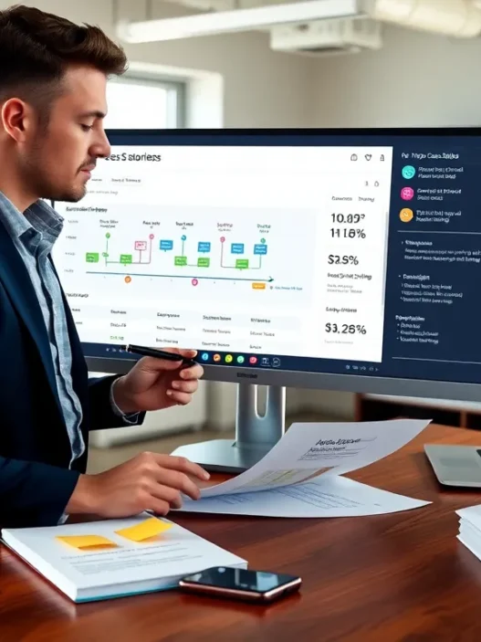
Even agencies get a unique toolkit. Wicked Reports makes it effortless to craft visual, client-facing reports that highlight ROI. Custom dashboards ensure every stakeholder gets what they need without wading through irrelevant info. This helps me build trust and transparency in every client call.
Curious if Wicked Reports could streamline your marketing analytics? See for yourself and explore Wicked Reports now. Keep reading for my FAQ, where I answer real-world questions on attribution tools! 🚀
Conclusion
After exploring Wicked Reports firsthand I can confidently say it’s a compelling choice for marketers who want deeper clarity into their campaigns. The platform’s focus on actionable insights and ease of use makes it stand out among attribution tools I’ve tried.
If you’re looking to optimize your marketing spend and drive smarter decisions Wicked Reports deserves a closer look. It’s helped me streamline analytics and uncover what truly moves the needle for my business. Give it a try if you’re ready to take your reporting to the next level.
Frequently Asked Questions
What is Wicked Reports?
Wicked Reports is a marketing attribution platform that consolidates and analyzes marketing data from multiple channels. It helps businesses track which campaigns drive sales, providing clear ROI metrics and actionable insights to optimize marketing strategies.
How does Wicked Reports improve marketing analytics?
Wicked Reports offers advanced attribution models, cross-channel tracking, and visual dashboards. It allows marketers to identify which campaigns and channels generate the best results, providing precise ROI and customer lifetime value data for better budget decisions.
Which marketing platforms does Wicked Reports integrate with?
Wicked Reports integrates with major platforms like Shopify, Facebook Ads, Google Ads, and HubSpot. While it supports many popular tools, some niche platforms may require custom setup or additional integration work.
What attribution models does Wicked Reports offer?
Wicked Reports includes first-click, last-click, full-impact, and time-decay attribution models. Users can easily switch between models to better understand which customer touchpoints contribute most to conversions and sales.
Is Wicked Reports suitable for small businesses?
Wicked Reports is a powerful tool, but its premium pricing may be a barrier for very small businesses. It is best suited for digital marketers, agencies, and e-commerce businesses that need advanced attribution insights and can justify the investment.
How easy is it to set up and use Wicked Reports?
The setup process is streamlined, usually taking less than twenty minutes to connect with major platforms. The user-friendly dashboard, color-coded walkthroughs, and visual checklists simplify onboarding, but some users may require time to learn all features.
How much does Wicked Reports cost?
Wicked Reports offers pricing plans starting at $247 per month for up to 3,000 tracked leads. Larger businesses can opt for custom-priced Pro plans. There is no free plan, but a 14-day money-back guarantee allows new users to try the service risk-free.
Does Wicked Reports offer real-time tracking?
Wicked Reports provides regular data sync and timely updates for most users. However, data sync speed may be slower during high-traffic periods, potentially causing slight delays in real-time reporting.
What are the main pros and cons of Wicked Reports?
Pros include advanced attribution models, cross-channel insights, visually appealing dashboards, and actionable ROI metrics. Cons involve a learning curve for new users, premium pricing, occasional data sync delays, and limited integrations for niche platforms.
Who should use Wicked Reports?
Wicked Reports is ideal for digital marketers, e-commerce business owners, and marketing agencies seeking reliable attribution, improved ROI analysis, and simplified reporting across multiple marketing channels.